CHURN is used in many contexts but is most widely applied in business concerning a contractual customer base, for example, in businesses with a subscriber-based service model such as mobile telephone networks and pay-TV operators. The term is also used to refer to participant turnover in peer-to-peer networks.
Churn rate is an input into customer lifetime value modeling and can be part of a simulator used to measure return on marketing investment using marketing mix modeling. Imagine a paid television company that regularly has new subscribers but loses some of the old ones to the competition. Why did the customers leave? Is there a specific period of the yearthat we lose more clients? Or a specific motive? Or imagine a car rental company that wants to see if their regular customers are still renting cars or they are preferring another type of transportation so it can adjust the business strategy. What is the type of service that the company is losing its clients to? Clear and consistent visualization of its churn rate is a must for any company that wants to improve its product quality,therefore improving the profit.
Thanks to CRM Ananlytics (Einstein Analytics), riverBI was able to create this visualization using the Analytics cloud from Salesforce. We started the creation of the dashboard by using a mock data example sheet and uploading it in Einstein, bycreating a dataset (a group of data to be used inside EA).
After creating the dataset, we can manipulate and explore it in EinsteinAnalytics, by making calculations using its columns, creating new ones with formulasand buckets so we can achieve the precise and correct desired metrics, like, forexample, the number of churned clients versus the new subscribers on a particularmonth. After the calculations and the creation of the fields and metrics, we can start to properly build the dashboard. Einstein Analytics have by default several dashboard templates that can be used to display the data you want to see in the most consistent

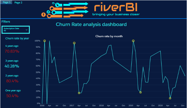
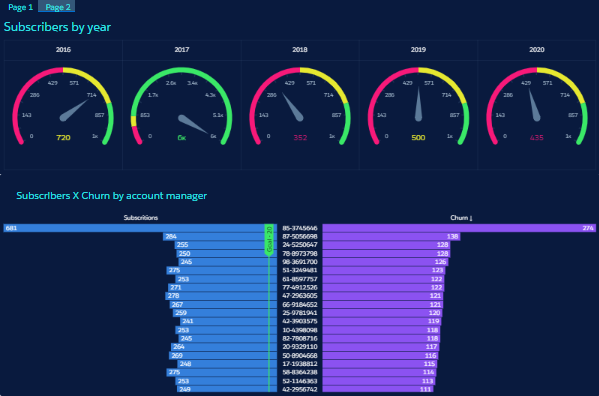
way.Each component on this dashboard is a widget that can be individuallycustomized, changed or replaced in order to improve the data visualization. In thiscase, riverBI also used conditional formatting to dynamically change the color of thepercentage values if they reach above or below one specific value. The date filterabove can be used to see all the periods (4 years) or to filter by specific dates of thewhole. RiverBI also used chart markers (yellow dots on the highest and lowest point) tosignalize and draw attention to these points so executives can ask themselves whatcaused the values to go so high or low. Also, there is a second page of the dashboardto show different metrics like new subscribers and the subscribers and churn by

accountmanagers:By clicking one of the bars or periods, you can filter all the other widgets toshow only data for that specific period or account manager, giving your company a full360° view of your churn rate. This is a product that riverBI is very proud of, cause thevalue it adds to the client’s businesses is really a difference maker in the company.


